The success of your paid advertising campaigns has less to do with the ad itself and more to with what happens after the click.
You can have the most persuasive ad copy, that perfect “eyeball-grabbing” image and buy the highest quality traffic… yet if your landing page is poorly designed for paid traffic, you’re going to have a really hard time achieving a positive ROI.
We’ve found 12 different styles of landing pages that are working very well for advertisers who drive millions of dollars worth of display traffic to their site every year.
In this post we’re going to cover what they are, who’s using them and why they work. You’ve probably seen some of them, but I guarantee there are one or two that will be new for most people.
Landing Page #1: Is It a Landing Page or an Article? It’s an “Article Lander”
One “new” type of landing page is the “article lander.” This is usually a presell page that looks like a news article, scientific study, press release or a blog article. They can be multiple pages (like the “Old School New Body” sales funnel we analyzed in the “Business of Display Part 4: Info Products” post) or they can be single page landers like the examples below.
These tend to work well because they don’t raise most peoples’ “Sleazy-Marketer-Wants-My-Money” flag. People have started to become blind to traditional sales letters, video sales letters or anything that indicates that someone wants them to buy something. An article lander just looks like an informational article.
Bills.com, a free resource for anyone with questions about finances, uses an article lander as a presell page for their financial services.
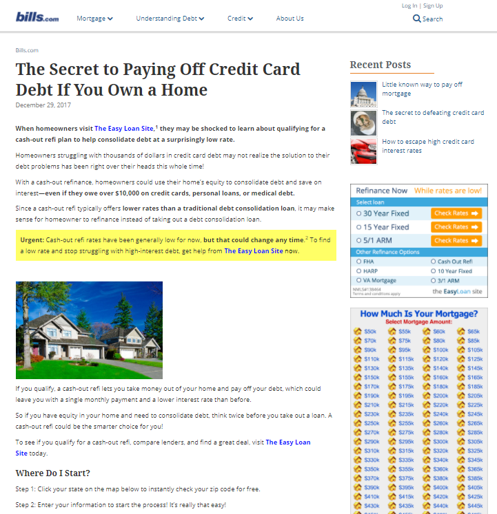
The article lander presells the customer on the benefits of debt consolidation. Once you read the article you’re going to be more receptive to actually finding out more about what you can do to manage debt.
The headline “The Secret to Paying Off Credit Card Debt If You Own a Home” is written like the headline from a news article or press release. There are even links to other articles to keep customers on the site longer. The body copy is written in the style of a news article with a slight sales twist.
Moral of the story: it doesn’t scream “advertisement.”
Article landers are also easy to A/B test. All you need to do is change the text on the page. A video sales letter, for example, requires you to re-record the audio, re-record the video, reformat the video, upload the new video, etc.
In addition, it’s easy to find the bottleneck in your funnel if you’re using a multiple page article lander. You can easily uncover which page causes the highest number of users to exit the page. For example, if you notice that a lot of people drop off on page 3 of 5 in the article sequence, you now know there is an issue with page 3 and can start to brainstorm ways to improve that specific page and NOT the entire sequence.
Landing Page #2: From Print to Digital — The Advertorial
Advertorials (also known as “Native Advertising”) were the hottest new landing page in 2014. They were even featured in an episode of Last Week Tonight with John Oliver.
These are the internet version of ads direct response marketers have been using for years in newspapers and magazines.
One of the best old-school marketers who commonly used these ads was Gary Halbert. In one issue of his “Gary Halbert Letter” he writes:
Make Your Ad Look Like A News Story
Here is how to “think” about your newspaper ads. Think about what could be the best possible piece of luck you could have. Think about a reporter who heard a rumor about your product or service and decided to check it out. And then, he fell in love with it. In fact, he loved it so much, he went back to his typewriter and wrote a full-page rave article about what you are selling.
Here’s an example of an old-school advertorial selling a new fishing lure:
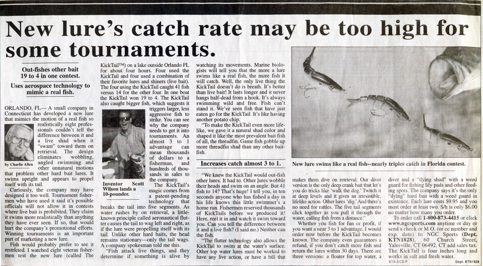
Advertorials are very similar to article landers. The small difference is that Advertorials are always made to look like news stories and are written in a more “newsy” style. Article landers can be written in this style, but it’s not a hard-and-fast rule. Article landers also tend to be hosted on the company’s domain. Advertorials are often found on “Advertorial Portals” like Health Headlines, How Life Works and First to Know. These sites buy display traffic and send it to advertorial content that contains an affiliate link.
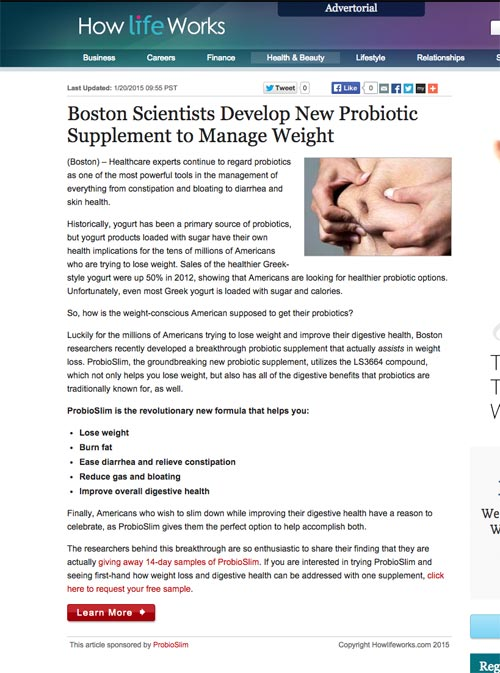
Here’s a great example of an advertorial for a probiotic health supplement on How Life Works:
Here’s another example from LowerMyBills:
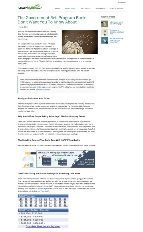
Both advertorials educate the consumer the way a news article would BEFORE they pitch the product. The probiotic advertorial explains what a probiotic is and why it’s beneficial. The LowerMyBills advertorial teaches you about a new government program called “HARP,” which was created to help homeowners refinance their mortgages and save money.
Advertorials can work very well at building trust as a presell page in just about any market.
Landing Page #3: Tell Me About Me — The Quiz/Survey Landing Page
Over the past couple of years more and more marketers have been using quiz and survey landing pages. They’re a bit more complex to set up, but they work very well with cold traffic (we’ve seen the results firsthand).
Basically, an advertiser sends traffic to a landing page where the prospect uses a quiz to figure something out about themselves.
- Why they can’t lose weight…
- The acidity level of their body based on the foods they eat…
- The problem with their golf swing…
There are three reasons why these work:
- Again, it’s not obvious it leads to a sales pitch.
- If done right, the information that you’ll receive is tailored to your specific needs. It’s not a pre-packaged solution meant for everyone under the sun. It’s for YOU.
- People crave to know more about themselves and why they suffer from certain problems. This is why Cosmo quizzes, BuzzFeed quizzes and the daily horoscope are so popular.
Here’s a great example from Alkaline Foods, a site that sells products related to the Alkaline diet (a diet based on the premise that the cause of many health issues is due to high acidity levels in your body).
The landing page is very simple and just has a call-to-action to take the quiz.
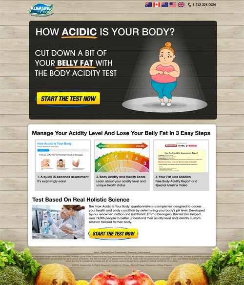
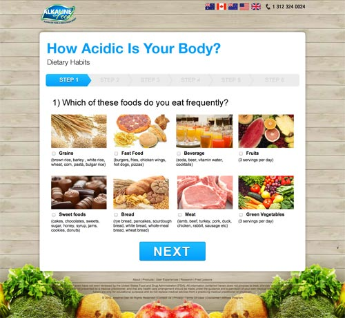
You then take a six-question survey. Like a multi-page article lander, you can see where people drop off and fix that specific question. Sometimes people will exit the page if they find the question too “difficult.” The theory being that they’d rather quit the survey than answer the question wrong (even if there are no wrong answers).
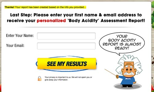
They eventually ask you for your name and email so they can send you the link to your report (getting you to opt-in to their list in the process).
Then you’re given the report on the next page (without having to check your email).
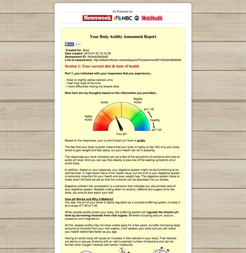
At the bottom there’s a link to a video “The 5 Super Foods” which is a VSL for “Energize Greens,” a natural greens supplement.
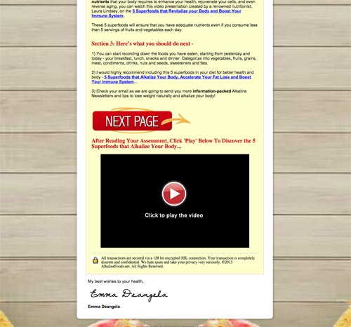
Even though they eventually try to sell you a product, they’ve already built trust with the quiz + report on your body’s acidity levels. You’re more likely to trust them AND buy their product as they’ve already given you valuable information that can help with your health.
Landing Page #4: WARNING… It’s the Video Sales Letter
The video sales letter (or “VSL”) was created/made popular by marketer Jon Benson. He created the first “ugly” video sales letter for his diet book, “The Every Other Day Diet.”
Over the years they’ve gotten more and more advanced with some people spending thousands of dollars on copywriting and production, but the majority of people still do it the “ugly” way: words on a PowerPoint being read out loud.
The advantage to using a VSL is that prospects don’t have to read. We live in an entertainment-based society and most people prefer to watch videos than read text. Plus, the video format forces them to listen to your sales message. They can’t scroll down and look at the price of the product like a traditional sales page. They have to wait until they get to the end of your video, after you’ve already had time to sell them on the benefits of your product. When you do a good job, the price becomes irrelevant.
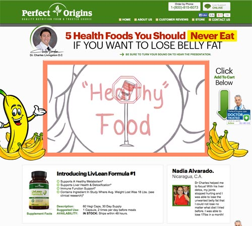
One of my favorite VSLs at the moment comes from Perfect Origins, a nutraceuticals company that specializes in weight loss and probiotic supplements:
Landing Page #5: The Lead Generation Page
Lead magnets are a great source of traffic for advertisers doing lead generation. A lead magnet is an incentive that you offer users in exchange for their email address. It can be anything from an infographic to an eBook to access to a bonus webinar. The point is to offer something of value to increase the number of leads you get.
Zoom, a video conferencing platform, uses a lead magnet on their landing page to grow their email list.
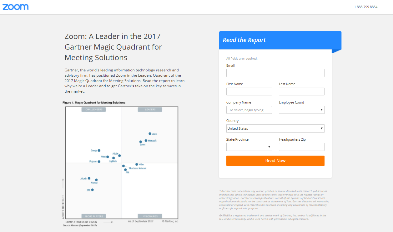
Users can enter their contact information to get the 2017 Gartner Magic Quadrant for Meeting Solutions report.
Given that they’re reinforcing their brand compared to their competitors, you know that the information is going to also be useful to users. Once the form’s submitted, the report’s emailed to the user for review.
Very simple, very effective landing page style.
Landing Page #6: Just Give It to Me — The Simple Sign-up/Opt-in Page
The more straightforward your offer is, the more simple your landing page can be.
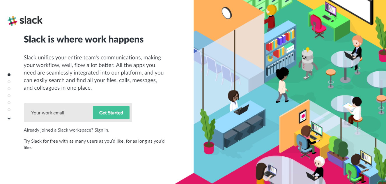
For example, Slack is a leader in virtual team communication. Their sign-up landing page simply explains what they offer and the benefits users get. There’s an offer asking new users to sign up for free and use the free plan for as long as they need.
Landing Page #7: Thou Shall Not Enter — The Gated Landing Page
Everyone knows the importance of building up an email list. But building up a list is doubly important if you’re running an eCommerce store.
When a user comes from a display ad to an eCommerce store, they’re likely going to get caught up browsing the products. If they end up NOT buying something, they’re probably just going to exit the page, not bother to opt-in in the small section on the right and then completely forget about your eCommerce store.
One way that eCommerce stores have solved this is by creating a “gated” landing page. This means that the prospect is required to enter their email address before they’re able to browse the products.
Here’s an example from zulily, a huge eCommerce store that sells discounted clothing and items for your house.
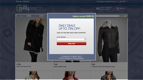
There’s definitely going to be a percentage of people who get angry and just exit the page.
However, the “Daily Deals Up to 70% Off!” copy is pretty tempting and most people are going to be willing to opt-in just based on that.
Another eCommerce that uses a gated landing page is Frank & Oak, an online menswear store.
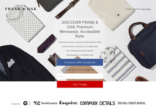
They’ve chosen to go the “premium” route and make it feel like an exclusive club, as opposed to zulily’s strategy of offering great deals. Plus, all the logos at the bottom are great social proof. Most people are going to see these and trust them enough to enter their email.
Landing Page #8: All Are Welcome – The Ungated Landing Page
The more laid-back cousin of a gated landing page is an ungated landing page. These landing pages have content that’s freely available for anyone to see and use. So unlike gated landing pages, when users get to an ungated landing page, they don’t have to enter an email address to access your content.
Ungated landing pages build brand awareness and reduce friction. Think about it. If someone is online researching for their business but only gets partial information, think about how excited they’ll be when they click on your paid ad, arrive on your landing page and find full, free access to your content. Chances are they’ll willingly give you their email address just so you can send them more information.
These users are qualified leads because they’ve shown an interest in you. Chances are good they’ll keep coming back and eventually buy something from you.
Clearbit, a data enrichment tool, uses ungated landing pages to offer users access to their data-driven marketing eBook.
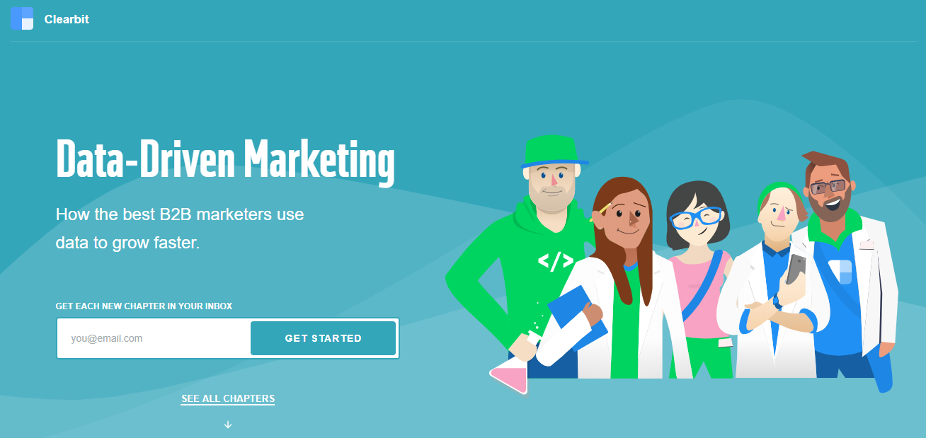
When users click on the “see all chapters” link below the email form, they’re taken to the section of the landing page where they can link to any of the available 12 chapters.
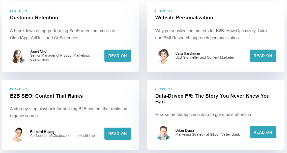
Users have the option to enter their email address if they want the book emailed to them but this isn’t required.
Landing Page #9: Say It Again – The Repeat Offer Page
Motivational speaker and author Zig Ziglar put it best when he said, “Repetition is the mother of learning, the father of action, which makes it the architect of accomplishment.” By having a landing page designed to repeat your ad’s message, you encourage users to take action. It’s clear to them what they get now vs. waiting to buy later on.
Let’s say you have a special offer, a new product feature or something else that gives users lots of value: use this landing page style to reinforce the message.
On GoToMeeting’s landing page they’ve included a special offer callout message. It’s right at the top of the page and in green, which stands out from everything else on the page and reminds visitors to buy the annual plan and save 20%.
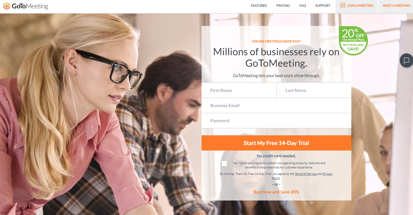
What’s great here is that the offer’s repeated again just below the orange “Start My 14-Day Trial” button. Users can either start a trial or pay up front and save.
Landing Page #10: The Soft Touch Video Page
With attention spans getting shorter by the year, videos work to get users to stop scrolling and listen to what you have to say. This page style works when videos are less about making a sale and more about showing off the culture within your company.
For example, depending on your user base, use a little humor in the video to come off as less stiff and formal. It makes you relatable, and the more users can relate to you and your product, the more likely they’ll be to want to use it and pay for it.
Wistia, a platform that helps businesses create, manage and share videos, uses a video on its paid advertising landing page to set the tone for the kind of experience visitors can expect.
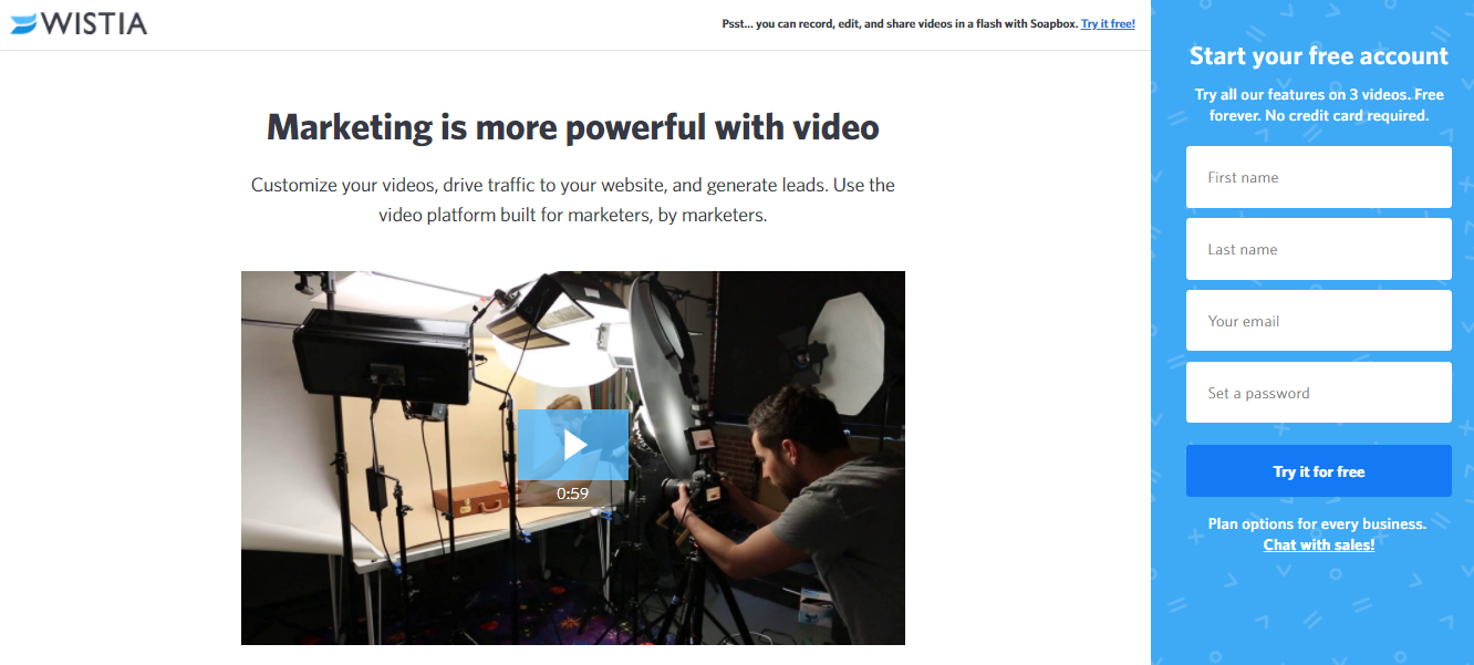
Wistia is a fun and lighthearted company and their landing page video speaks to that. The video in this particular example is only 59 seconds long but it packs in a ton of information about how to use the tool and when to use it — all with a little humor added in. There’s some animation and shots of teams having fun interacting with each other. It’s informative and not at all pushy.
Plus, the lead generation form right next to the video makes for a smooth enrollment process for users. The video gets them excited about the product and the form closes the deal.
Landing Page #11: Get Moving! – The Countdown Page
Fear of Missing Out or FOMO is the idea that the thought of missing out on an event or experience causes some people anxiety. When it comes to marketing, you can use FOMO to emphasize time-sensitive opportunities to get users to do buy something.
Whether you’re promoting an event like a webinar series or a new product launch, use a countdown to get people excited and to emphasize registering or buying sooner rather than later. Set the time to track for a week or two. You can set it for longer but it’s more impactful and gives a sense of urgency the closer to the deadline it is. The whole point of the timer is to create FOMO. Give leads too much time and they might store the information thinking they have time to take action but don’t come back to do anything.
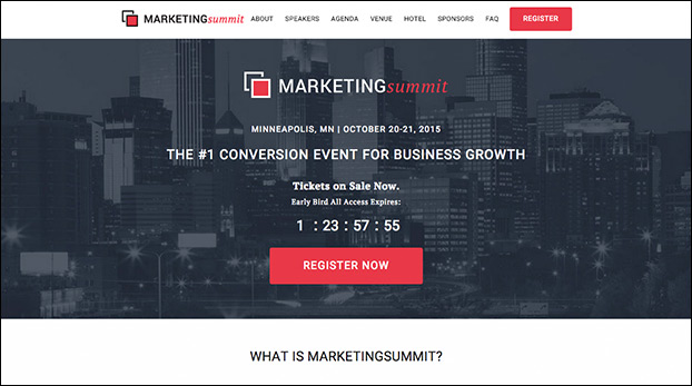
Marketing Summit used this idea to promote their marketing conference. To get visitors to sign up for the event, Marketing Summit included three design elements on their landing page:
- A tagline that gives insight into the value people get from attending
- A countdown clock showing how much time’s left to register
- A large, bright CTA button to drive leads to take action
Landing Page #12: The Testimonial Page
Social proof is a powerful way to grow your email list because it uses feedback from current users to influence new users. Anand Iyer, the former Head of Product at Threadflip, frames the power of social proof this way:
Ultimately, marketplaces are social businesses. They depend on relationships and network effect. That’s why you can drastically lower the barrier to entry for new users and increase conversion by leveraging social proof — basically promoting that many other people are using and loving your product.
When new users see testimonials from current users they see the product as more valuable. Social proof also helps you grow trust with new users who are still getting to know you. A landing page dedicated to users’ testimonials does just that.
Infusionsoft is an email marketing and sales platform for small businesses. For example, users can build automated campaigns that help them manage their email marketing more efficiently.
When users click on an ad and land on the landing page, they’re greeted with a list of real customers, their company and contact information.
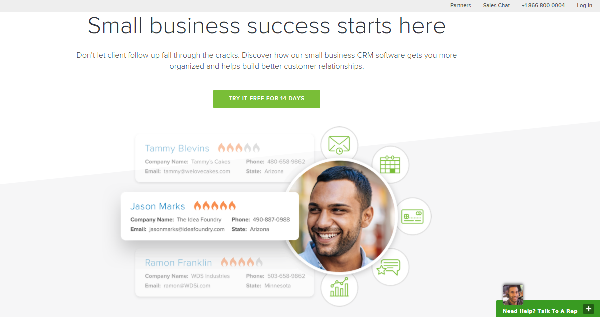
As users scroll down the landing page they see some of the features Infusionsoft offers. What’s great here is that mixed in with theses features are testimonials backing up each one.
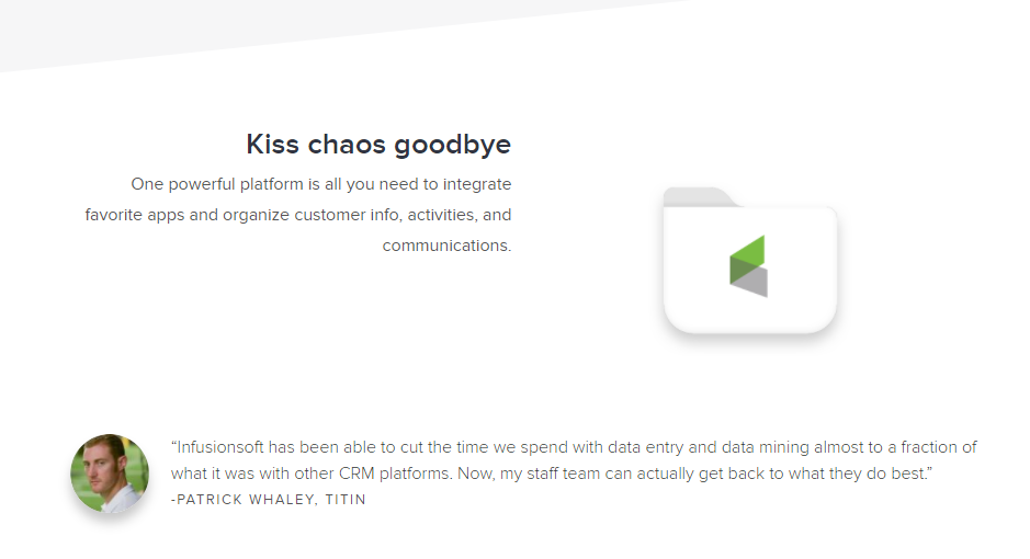
Also worth noting is the landing page includes two places for users to sign up. There’s a green CTA button at the top of the page and a form with four fields at the bottom of the page. So users have the option to sign up right away based on their initial impression or wait until they get to the bottom of the landing page and learned more about the product and features.
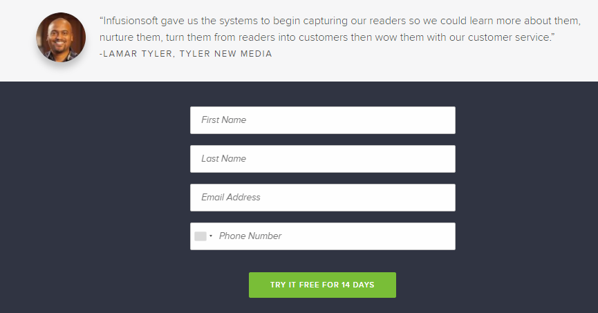
There are only four fields so it’s a short and easy form for users to fill in and get started.
Put your plans in motion
Your landing page is one of the most important components in getting paid advertising to work. All 12 of these are proven page types that work depending on your offer and your audience.
Great article, aside from the fact that you actually think Benson “created” the VSL, or that the one he did for his diet product was “the first ugly vsl”.
Might wanna fact-check that as VSLs were selling products long before Jon ever even learned what one was
I thought so, too. But lately I’ve been seeing Benson credited more and more with having “invented” the VSL.
I wonder if anyone can find an example that pre-dates Benson’s diet book?
Jon certainly did not invent the VSL, however he was the first who systematized writing a good one and created a great template-based (Saas) product for producing your own. His content is good, however some tricks might be a little outdated by now such as intro based on pattern interrupts.
Thanks Mike, as always very interesting and informative, its gives me some good thoughts about the way of using the optin forms gates on my websites.
Thanks for the comment Ted!
Let us know if you decide to test out gated landing pages. We’d love to hear how they work for you.
Awesome post man! I’ve been searching around for good presell page examples and now I have 7 to check out! Great post 🙂
Brad I am working on article lander but I have one important question and i.e Should we using links inside the content which we are using in lander or just give button at the end of the website.
Hey Dian,
Most advertisers put links inside the content in addition to the button at the end. I would copy what they are doing.
Good luck with your lander!
Hey Brad,
Excellent overview of landing pages – which are so critical for sales and opt-ins – to give us some ideas.
I’ve heard advertorials work well, but I think you really have to be a pro to do them well, since they are written like professional news articles.
thanks again
Larry
Hey Larry,
Thanks for your comment!
Actually, advertorials are not *too* difficult to write.
In fact, we just put together a blog post all about them.
Read it here:
https://blog.adbeat.com/how-to-write-a-native-ad-landing-page-3-case-studies/
Brad
Hi Brad,
Which state level of customer awareness do you think the How Life Works Advertorial on Probiotics is targeting? Level 4 or 5?
Yeah man, Great article. I guess I will give this blog some reading time…Your advert on facebook hooked me good…lol
Great Article. Thanks for the detailed analysis. However, as a graphic designer, I must say all of the above landing pages are ugly as sin. Funny though that sometimes the ugly ones convert best.
It’s almost *always* the ugly ones that win, hands down. 10 years of doing this and it’s pretty much always true (sadly, as I’m a sucker for something well designed!).
Great post! I am wondering, with all of the landing page builders out there.. Are there any platforms that build out advertorial style pages and “blog post” style pages?
I did a landing page with long content and to my surprise it was giving better conversions and more engagement. So what do you think should we go with bigger landing pages or smaller landing pages Brad ?
Hey Yomar,
The key is to A/B test.
I would test a long page vs. a shorter page and see which one gives you better results.
Thanks for your comment!
Without knowing how to code…is there a WP plugin with pre-built forms that I can use to build these type pages? I am not looking for expensive Click Funnels type
Hey Paul,
That’s a great question. Unfortunately, there are not many inexpensive options. You might want to check out OptimizePress. It’s not extremely cheap, but there is no monthly fee.
Any tips for a good “advertorial” page building resource?
Thanks