What approach do you take when creating a landing page? Do you throw something together and hope for the best? Do you consider every last element, realizing that even the smallest details can have a big impact on conversions?
Let’s start here: there is no right or wrong way to create a landing page. What works for you may not work for the next company. And what works for them could lead you to plenty of lost time and money.
Even so, all the best landing pages share the same elements and basic approach.
Unbounce, an industry leading landing page builder, shares the following five elements of every successful landing page:
- Your unique selling proposition (which should be mentioned several times)
- Images and/or videos explaining the product/service
- The benefits of the product/service, typically broken down into bullet points
- Social proof (testimonials are great)
- Call-to-action
With all five elements, your landing page is designed with conversions in mind. With four or less, you may struggle to reach your full potential.
The general goal of every landing page is the same: for a visitor to take action, such as placing an order or sharing their email address.
This leads us to a telling statistic on conversions shared by WordStream:
A typical website conversion rate is about 2.35% on average. But the top 10% of companies are seeing 3-5x higher conversion rates than average.
If you want to find yourself among the top 10% of companies, keep reading. We’re going to share five landing page examples, along with something important you can learn from each. Here we go!
1. StartupBros (Call-to-action)
There used to be a time when getting someone to download an ebook was easy. There wasn’t a lot of information out there, so people jumped on any opportunity to learn from a professional (even if that wasn’t the true intention).
In today’s day and age, this is much more difficult. Online competition is higher than ever before, which is why it takes a detailed approach to generate a high download rate.
Above, we discussed the importance of a strong call-to-action. Well, that’s exactly what you get with this landing page.
There are a couple of things to pay attention to here:
- The use of the ebook image before any content, which provides a clear idea of what the page is about
- The opportunity to download the ebook before reaching the end of the landing page
- A final reminder in the last sentence to take action
Here’s a closer look:
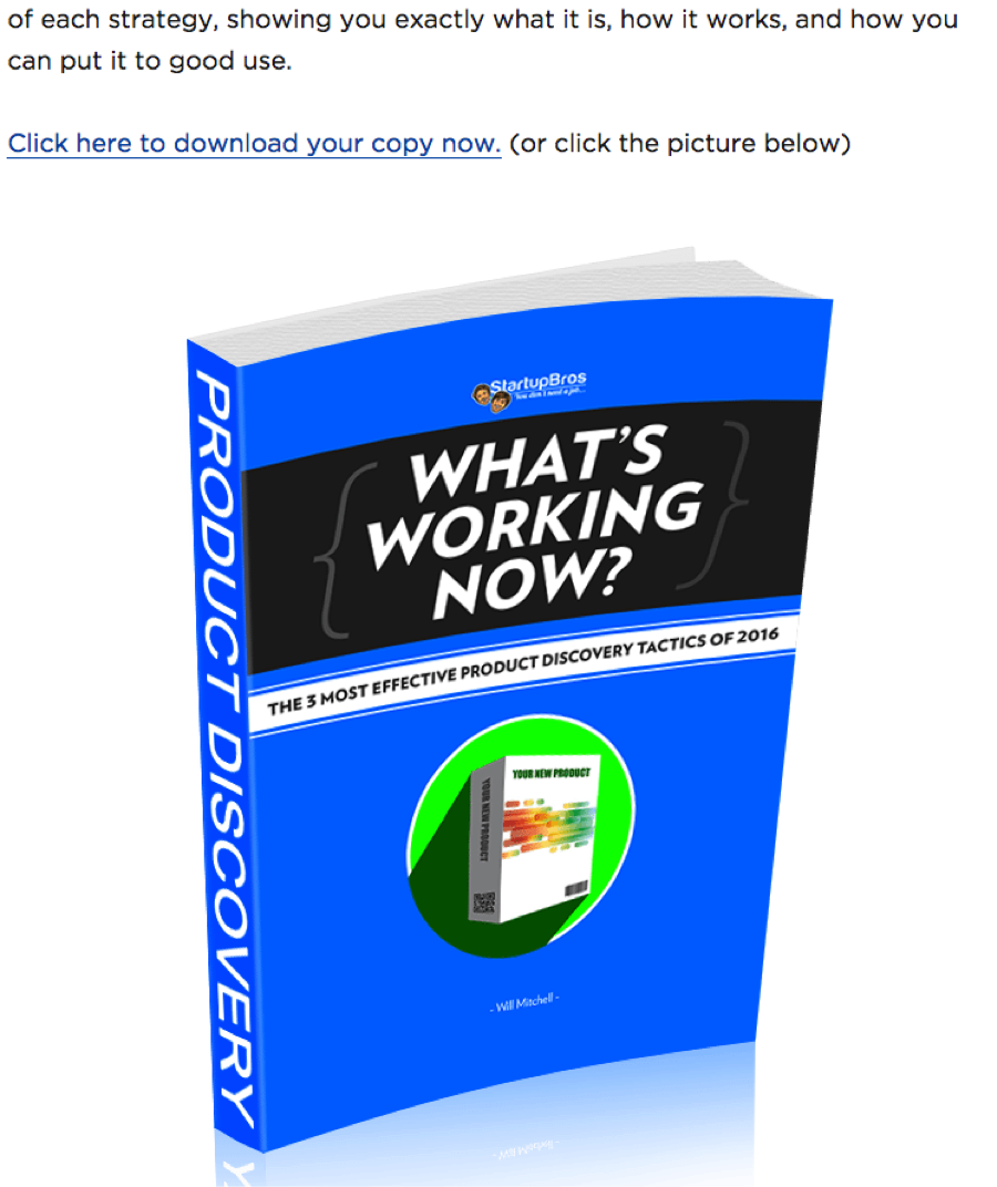
Up to this point, the landing page is focused on exciting the reader by touching on pain points and discussing “how to break free.”
Then, you see this(above). It’s a clear call-to-action allowing you to either click a link or image to download the ebook. There’s no confusion. There’s nothing to stop you from simply clicking and downloading.
If you pass up this opportunity, the final line of content hits you again:
A successful landing page doesn’t have a single call-to-action. There’s more than one reminder to take action, and sometimes that’s exactly what it takes to generate a strong response.
2. Ecommerce Empire (Social proof)
A solid call-to-action is a must, but this will typically fall on deaf ears if it’s not backed up by social proof.
You want your readers to feel like they’re missing out if they don’t take action. You want to give your readers peace of mind by showing them that others have taken the first step.
Ecommerce Empire goes above and beyond with social proof, providing several different types of testimonial.
To start, there’s the standard testimonial that looks something like this:
These are the easiest to secure, as you aren’t asking your customers to do anything more than provide an honest review.
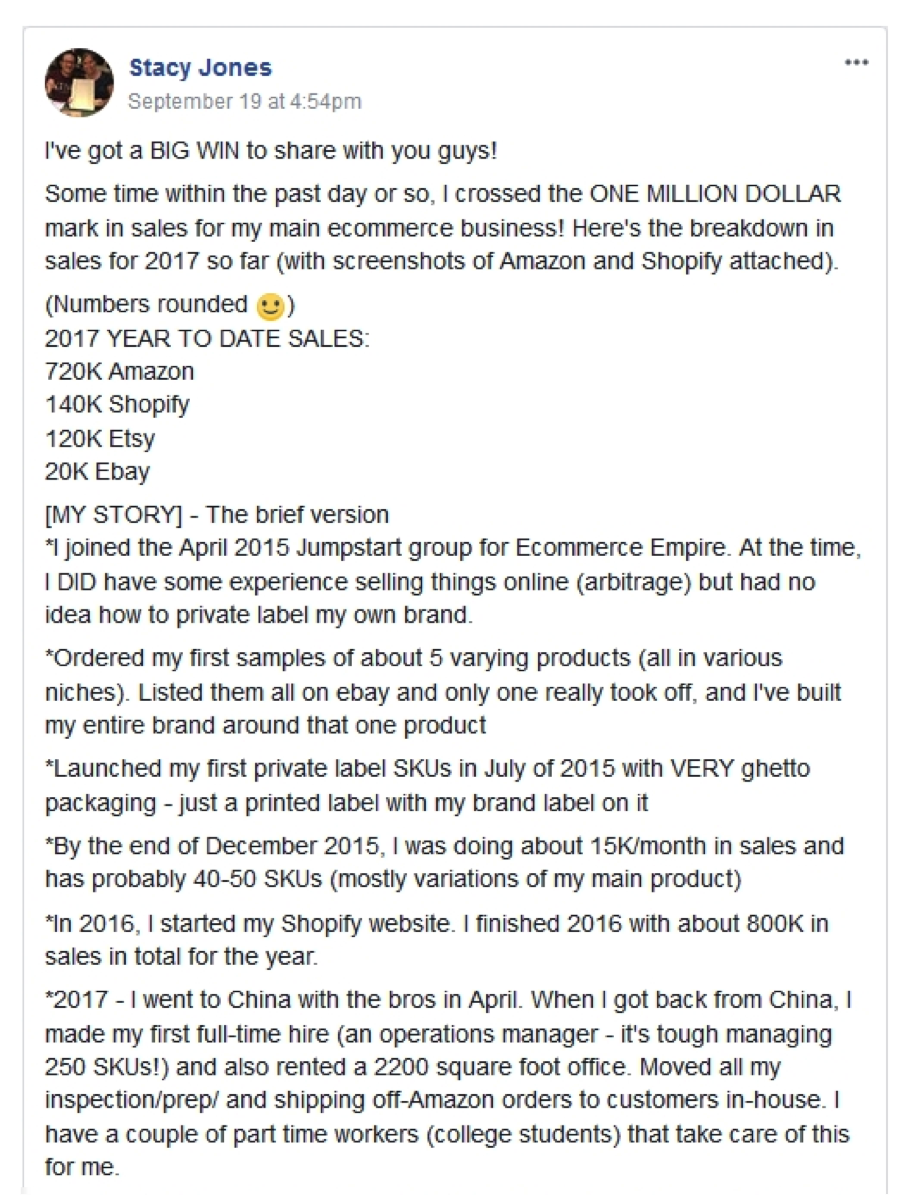
If you want to take things to the next level, seek out this type of social proof:

Anyone can say you have a great product or service, but this type of proof goes above and beyond that. A sales screenshot like this provides extra value, as it speaks louder than words.
If you have testimonials, experiment with the many ways to share them on your landing page.
And if you don’t have testimonials, dig some up before the official launch. Even if it means sharing your product or service for free, it’s better than publishing a landing page without social proof.
3. Neil Patel (Benefits)
As one of the top minds in the internet marketing space, it’s no surprise that Neil Patel knows a thing or two about creating aesthetically pleasing, high converting landing pages.
You don’t have to look any further than NeilPatel.com to see what we’re talking about.
There are many things that will catch your eye, but for the sake of this section we’re focusing on the emphasis put on the benefits.
Neil gets right to the point by adding this section shortly after the heading. Here’s what you see:
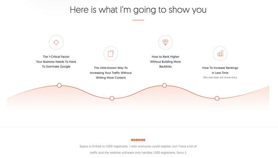
It’s not your typical bullet point arrangement (it’s horizontal instead of vertical), but it takes on this basic form. Here are three things to make note of:
- The heading: through the use of a strong heading – Here is what I’m going to show you – there’s no question about what’s to come. You know exactly what you’re getting if you continue to read.
- A break down of four specific points: it’s clear as to what you’ll learn if you sign up. The four benefits are laid out in an easy to follow manner.
- A sense of urgency: this isn’t something you have to do, but it may help improve your conversion rate. By adding a warning about “limited space” readers are more inclined to take immediate action.
Above all else, this example shows that there’s more than one way to share benefits and product features on your landing page. It doesn’t have to be the “same old” bullet point list.
4. Backlinko (Use of image to explain the product/service)
The best landing pages include just the right amount of text. There’s enough words to get the point across, but not so many that the reader becomes bored before taking action.
But remember, there are other ways to connect with your audience. For example, the use of images and videos can be very powerful, even if you only include one (or one of each).
The Backlinko landing page is designed with one thing in mind: for visitors to share their email address in order to access a strategy and case study on how to increase organic traffic.
Right before the “click to access” button you’ll find the following:
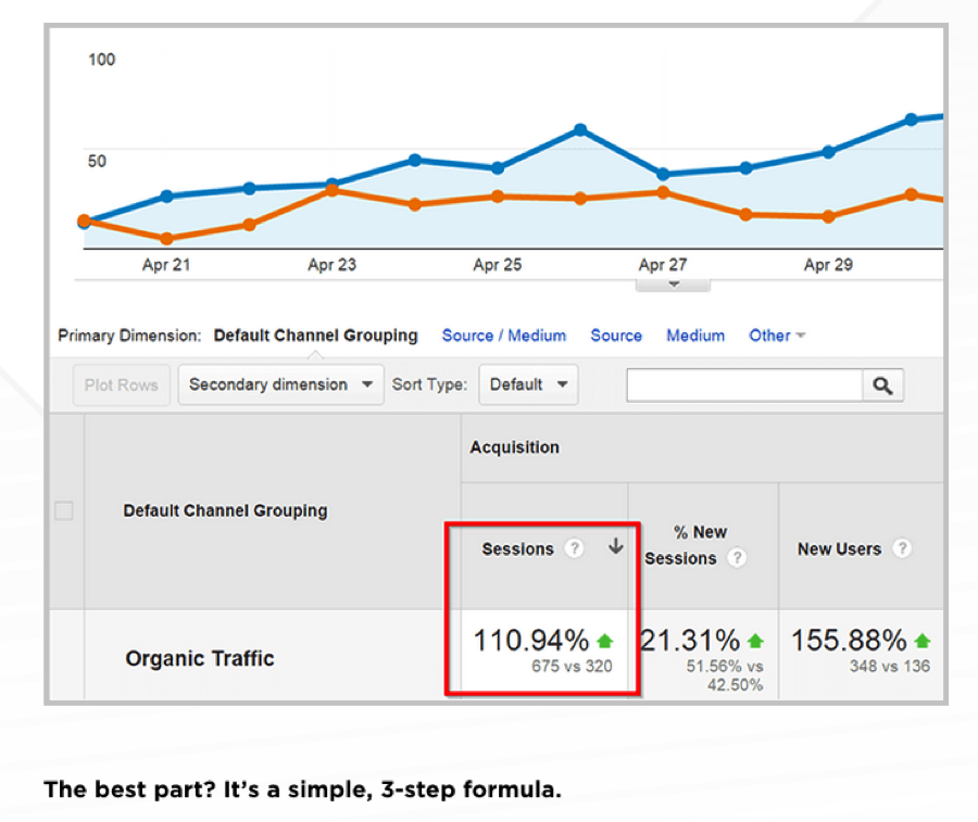
The use of this image does three things:
- It acts as social proof, as the strategy is backed up by cold hard statistics
- It breaks up the content, giving the reader something else to focus on
- It excites the reader immediately before they have the opportunity to sign up
The Backlinko landing page only has one image, but it’s a powerful one that’s designed and implemented with conversions in mind.
5. Teambit (Unique selling proposition)
A landing page should leave no questions unanswered as to what the product or service is, and more importantly, why and how it stands out from the competition. This is where a unique selling proposition comes into play.
The Teambit landing page does a nice job sharing its unique selling proposition multiple times in a variety of ways.
You’re hit with it as soon as you visit the page:

This isn’t a lot of text. Furthermore, it’s not displayed in any special way. However, it clearly tells the reader what Teambit does and how it can help. There’s no guesswork here.
As you make your way down the landing page, the unique selling proposition only gets stronger.
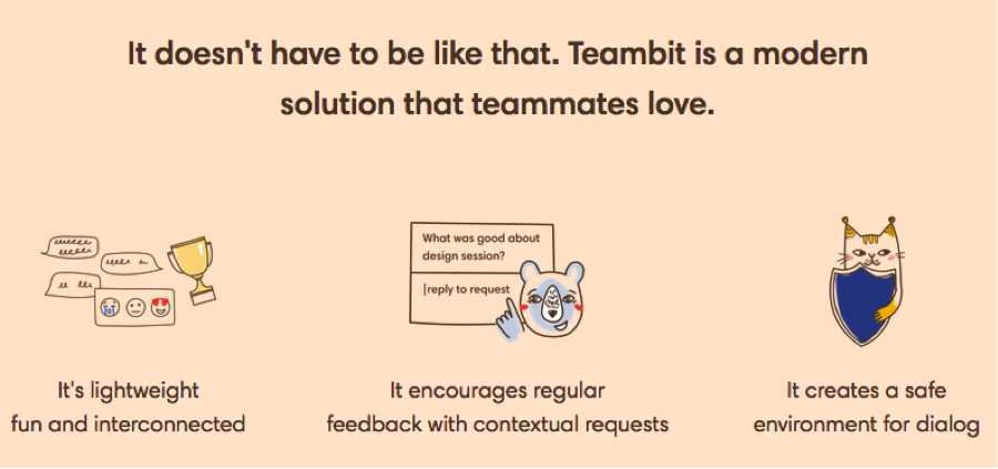
This section, located approximately one-third of the way down the landing page, dives into the finer details of what makes Teambit better than the competition. Pay close attention to:
- The use of a powerful headline that plays into the reader’s emotions
- Three unique benefits of Teambit conveyed in an easy to digest manner
- The use of images to attract and maintain the reader’s attention
If you learn nothing else from the Teambit landing page, let it be the fact that you can (and should) share your unique selling proposition in a number of ways.
Conclusion
Now that you’ve reviewed these five examples, you should have a better idea of what it takes to create a well-optimized, high converting landing page of your own.
As long as you’re open to making changes and obsessive with testing, you’ll find your landing page in a better place soon enough.
What are your thoughts on these landing page tips? Have you followed this advice in the past? Would you add anything else?