The least effective way to A/B test ad creatives — and how most people do it — is by guessing.
They change a color here, switch a picture there, try out a new tagline… but it’s all done randomly and with little direction.
The better way to test is to see what your competitors and other large advertisers are doing. What colors, layouts, elements and copy are they testing? Which ads have been seen more often? Which ads have they stopped running due to being ineffective?
This is where competitive intelligence comes in.
In this blog post, we’ve taken ads from 7 different advertisers and broken down 3-4 different ad creatives they’ve been testing. At the end of each section, the “winning” ad will be revealed.
You can use these tests below as inspiration for designing your own split tests.
How We Determine Winners
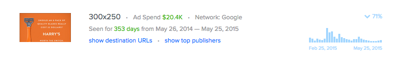
Most major display advertisers are hesitant about sharing results or strategies when it comes to display. That’s why we created Adbeat.
Using Adbeat, we determined winners by choosing the ad with the highest ad spend and two other important factors: whether or not the ad had a stable or rising trend line and how long the ad has been seen. (When you start to see an ad trending downward, that’s a good indication that this specific ad has started to burn out.)
Adbeat lets us see all of this data easily. Here’s what that looks like:
Harry’s
The color scheme of an ad can make a big difference when it comes to performance.
Harry’s is a mail order razor blade company. They’ve tested a couple of different pieces of copy, but it seems like the headline “Should an 8-pack of quality blades really cost $32?” is working the best.
They tested this tagline with various color schemes.
Which color scheme do you think worked the best?
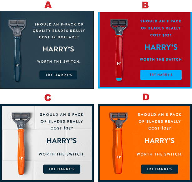
Winner(s): A and B!
Harry’s stopped running ads C and D a few months back.
Yet, the white, tiled background and the orange background are still being run. Probably because they are a bit cleaner and are more pleasing to look at. Bright, pleasant colors tend to work well in ads.
Nice to look at = nice to click on.
ITT Tech
Text display ads are still effective, especially on the Google Display Network.
ITT Tech chooses to only use their brand name in the headline.
However, they use 3 different angles in the body copy.
- Angle #1: “Education for the future”
- Angle #2: Lists the specific types of degrees and has a call to action
- Angle #3: Touts the number of locations and has a call-to-action to get a free brochure.
Most people always say things like you must have a call-to-action to see the best results.
But is this true?
2 of the top 3 ITT tech ads have calls-to-action and one of them doesn’t.
Which one has been their best performer?
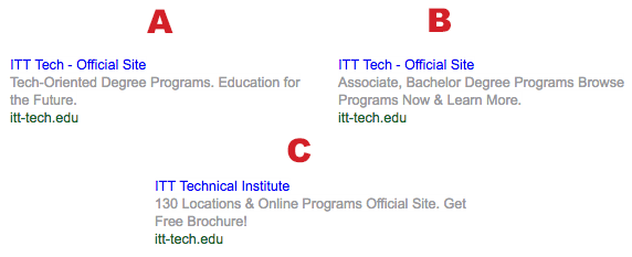
The Winner: A!
“Tech Oriented Degree Programs. Education For The Future”.
The ad without the call-to-action has been their most seen ad. This specific ad might work because it’s very simple and specific. They say exactly what they offer, which are “Tech Oriented Degree Programs”. The other most seen ad that lists the degrees is also very specific, but it just says “degrees” not “tech degrees”.
Notice that it doesn’t have a call-to-action at the end.
You should test out ads that have CTAs and ads that don’t have CTAs. You might be surprised to find out that one of them works better than the other. Sometimes one of the best A/B tests is to break the copywriting rules.
GCU
Occasionally the best strategy is to just try a bunch of different layouts, pieces of copy, images, and call-to-action buttons.
Grand Canyon University is testing 4 very different looking ads with different positioning, images, and call-to-action placements.
All of them are actually doing pretty well, but which one do you think is getting the most impressions?

The Winner: B!
Pictures of people — especially women — tend to work well in ads.
Ad creative C also has a picture of a woman, but there’s a few reasons why it might not be working as well.
The font, background, and design on ad creative D is a bit more sleek. It also has the call-to-action button in the right hand corner. When you look at the ad, you first see the women, then you read the copy, then your eyes end on the yellow call-to-action in the right hand corner. Since you’ve read the copy, you now need “something to do”, which is click through to the landing page. This is one reason why many advertisers choose to place their calls-to-action in this bottom right hand position.
Forbes
Forbes is making great use of traffic from Native Ad Networks like Taboola and Outbrain to drive ad revenue and page views.
These four ads link to the same article that lists the top 20 highest-paid athletes in the world. Each ad is being tested with a picture of a different athlete and with a different headline.
Floyd Mayweather appears twice, but did he win this ad competition?
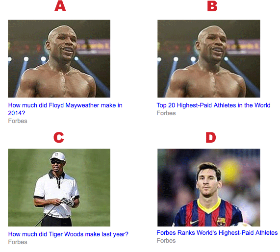
The Winner: A!
Ad creative A likely won because Floyd Mayweather has been in the news lately due to his recent fight against Manny Pacquiao. He’s someone who is on the general public’s mind.
Floyd’s case is also special because many people know he received an absurd amount of money for the Pacquiao fight. It’s highly relevant to the article and photo, which is why the headline that specifically mentioned Floyd likely works the best.
Carbonite
Carbonite is a cloud backup solution who is also testing out different color schemes.
Note that the ads are very simple. There’s just a bit of text that offers a bonus, Carbonite’s logo, and the “Buy Now!” button.
Your ads don’t need to be complicated for them to work.
So which creative won?
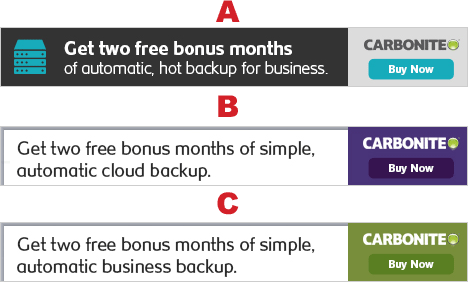
The Winner: B!
This one I’m not too sure about.
I would have guessed the first ad would win because the color scheme looks a bit nicer. The icon on the left-hand side also adds a nice touch.
On the other had, black and white might not work on some websites since it tends to get lost among the content.
I think ad B won over ad C because the green is a bit ugly. The purple is a bit more pleasant to look at.
Norton
Norton has been in business for as long as I can remember and they are still releasing software. They just launched a new piece of software called Norton Security.
The first two ads are very similar.
The only difference is one has a guarantee logo and the other has an icon of a computer, tablet and phone.
Ads C and D are more “branding” style and focus on Norton’s reputation
Does branding beat benefits?
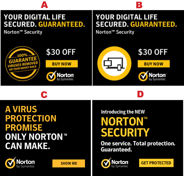
The Winner: A! (But B was close behind).
Both of these ads were run much longer than ads C & D. My instinct is the benefit driven headline (“Your Digital Life Secured. Guaranteed”) is more compelling and clearer than the headlines on the bottom two ads. People don’t care about Norton’s “promises”. They care about protecting their data.
Ad creative A likely beat out ad creative B due to the guarantee symbol. This is a much better use of space than an icon with various devices, which your eyes completely gloss over.
The guarantee logo in ad creative A looks like a seal of approval.
It builds trust, which is important when you sell software to protect peoples’ precious data.
NRA
Any time you’re giving something away for free — whether that’s a bonus for joining, for giving up their email or anything else — different “bribes” are going to work better.
NRA has tested a few free gifts.
Two of these ads are doing amazing. Two have been retired.
Which one is it?
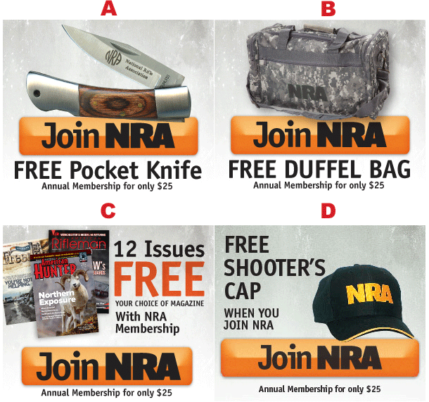
The Winner: B!
The duffel bag and the knife have been the most successful free offers for the NRA. The items themselves are more compelling and the images catch your eye a bit more. They’ve also tested an ad with a black duffel bag:
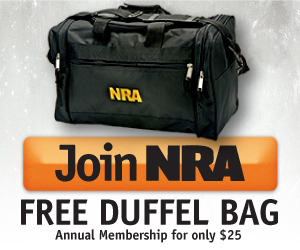
But that doesn’t seem to be working as well as the camo duffel bag ad. The lesson here is to test a bunch of different bribes, then test different versions of the most successful bribe.
Conclusion
There’s a ton of stuff that can be tested, but it’s best to not reinvent the wheel. See what other advertisers are testing and design your tests based off of their insights. It’s the easier, quicker. more economical way to test your ad creatives and see better results with paid traffic.
Hi, very good cases… what about the form of the CTA ? Is there any importance avec the size, color or message of the CTA ?